| Home | Blog | Ask This | Showcase | Commentary | Comments | About Us | Contributors | Contact Us |

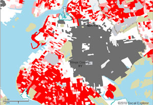
A new window into a still-segregated AmericaASK THIS | February 32, 2011A new online tool lets reporters explore the racial makeup of their communities almost block by block, offering new insights into residential integration and segregation -- and raising a lot of really important basic questions. By Dan Froomkin As the minority population in the U.S. continues to grow, the nation is, in aggregate, getting more diverse. But at the street level, it’s often a different story. And now, a new, web-based tool offers journalists a visually dramatic, incredibly granular look at the racial composition of their communities, almost at the block by block level. The tool is a creation of Remapping Debate, a relatively new online journal, and the research site Social Explorer. The data comes from the latest 5-year American Community Survey, and allows users to zoom down to the census "block groups" level, a smaller geographic unit than a census tract. The tool has been set up to make it easy to highlight areas that remain ultra-white, as well as areas that are disproportionately African-American or Latino or both. And the sad fact is that in most American cities there are effectively boundaries, on either side of which people of different backgrounds live mostly with people like themselves. “Segregation is an issue today even though a lot of people prefer to think that it’s not,” said Craig Gurian. “When you look at this map, it’s much harder to deny this very fundamental reality about American society.” Gurian runs Remapping Debate, which is devoted to raising fundamental questions about domestic public policy options and challenging the assumptions that sometimes limit the national debate. (A mission not entirely unlike our own, here at the Nieman Watchdog Project) He said the tool is intended as a starting point for explorations by journalists, hopefully all over the country. “This is a story that has at the same time highly visible elements -- which are shown on the map, and which become even more clear the more you zoom in -- and deeply invisible elements that require some very serious reporting,” Gurian said. Exploring your community through the tool “leads to a lot of basic questions,” Gurian said. For a reporter seeing clear lines demarcating racial boundaries in their community, the most obvious of those question is: Why are those lines still here? “Generally what will be found, with further investigation, is some significant level of exclusionary zoning, or local resistance to affordable housing being constructed,” Gurian said. Related questions include: “What kind of link is there to issues related to schools? What about issues relating to health problems? What about job availability? “We hope those questions will get asked.” What happens next is also predictable, Gurian said. When the reporter makes even preliminary inquiries, community leaders will fire back with two standard excuses. “One is that it’s all economics, and two, that the part which is not economics is choice.” But studies of segregated areas have found that the neighborhood composition cannot be solely explained by economics -- there are often areas that have similar economic characteristics but very different racial makeups. And Gurian, who is also executive director of the Anti-Discrimination Center, the sponsor of the Remapping Debate website, forcefully rejects the notion that choices can’t be influenced by external factors. A major tenet of American consumer society, after all, is “the recognition that consumer preferences are malleable,” he said. So what are the factors that lead people to make their residential choices? And are they being perpetuated today? In cities that have been historically segregated, defenders of the status quo will say it’s been like this a long time, and it’s what people wanted. “But that ignores the fact that these neighborhood patterns did not fall from the sky,” Gurian said. It’s worth examining the history of how areas became majority minority -- or all white, for that matter. For instance, the Federal Housing Authority played an active role in creating all-white suburbs all over the country. And then, of course, comes the question: What to do about it? “Any kind of battle to desegregate is not a popular one,” Gurian warned. “It’s quite apparent that many people like their segregation just fine.” But, he said, “inaction is a choice. It represents a decision to leave something in place.” Another valuable source of information for reporters is a website called diversitydata.org, run out of the Harvard School of Public Health. One of that group’s reports points out that “High levels of neighborhood segregation fuel high levels of school segregation. As a result, white students attend schools that are disproportionately white and low poverty, and black and Hispanic students attend schools that are disproportionately minority and high-poverty." More information about the American Community Survey’s segregation measures is available here, including a list of the major metro areas with the highest level of black-white segregation (starting with Milwaukee, Detroit, New York, Chicago, and Cleveland) and those with the most Hispanic-white segregation (starting with Springfield, Mass., New York, Los Angeles, Providence, and Boston.) Also see UCLA Professor and segregation guru Gary Orfield’s Civil Rights Project. UPDATE: For even more maps based on census data, see the New York Times’ Mapping America project from mid-December, which also lets you map Asian and foreign-born population, household income, change in household income, home values, change in home values, education and private school enrollment. h/t Huffington Post commenter alex98.
|


